 |
| This new logo is phallic in a first-person point-of-view way, isn't it? |
Whatever images these new icons may conjure, they are clearly a huge improvement over the triangle-and-teal designs of the last decade or so. The new jerseys feature a red, white, and blue color scheme befitting the nation's capital and matching the other tenants at the Verizon Center: the Capitals and the Mystics.
There are three primary logos associated with the team: a lowercase "dc" featuring the outstetched, tipoff image of the old Bullets wordmark, a basketball enclosing a star and the Washington Monument, and the updated, tricolor version of the Wizard from the last design scheme. The latter still remains the weakest link of the new set. The recolorization of the old logo was leaked back in March. Personally, I wish they'd done away with that one (more on that later).
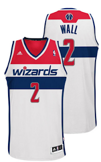
There are interesting differences between the two jerseys. The home jersey features a lowercase "wizards" wordmark
with the outline of the Washington Monument on the vertical stroke of the letter "d". The road jersey incorporates the most prominent use of the word "Washington" in the franchise's history. In my opinion, it's simple elegance is the highlight of the redesign. It also utilizes the outline of the Monument -- this time on the letter "h".
 |
This one is for John Wall, but Georghe would have looked great in this jersey. |
The shorts are well-done, too featuring a "W" on the side trim using the negative space from a star.
Below is a picture showing the new usage of the logo on a member of the Wizard Girls. Note the wordmark on the back of her uniform. Fantastic.
So to sum up, the design is largely a winner. The least satisfactory part of today's proceedings is that they didn't banish the old wizard. While the team may have felt the need to preserve a thread of continuity and keep the logo as a manifestation of the meaning of the word, I disagree. The history of the franchise since adopting the "Wizards" name has been cataclysmic, and in a league where franchises go by obscure, historic names (Knickerbockers, Pistons) as well as abstract new ones (Thunder, Magic), making the icon match the team name should not be highest priority. The Bullets tag was not an option under consideration, so the team connects to their past using the logo of the outstretched hands. It's very well done. Kudos.
But I still think that the Wizard should have been dumped for the Opera Singer. It has a historic connection to the past (the '78 title team), it popularized a phrase that has meaning even to non-basketball fans, and, well, it's just the epitome of awesomeness.
Wish you were here with us today, Opera Lady.


yo daddy i likes it
ReplyDelete